Color
Correct the colors of a photo and give it the mood you want. Fix colors that turned yellowish or bluish because of the lighting with white balance. Adjust the intensity of all colors with Vibrance and Saturation, specific colors with the Color Mixer and Color Targets, and the color mood of the whole photo with Color Grading and Look (LUT). You also make black-and-white photos here.
This page is long, so it's organized by panel. Use the table below to find what you need.
| Panel | On this page |
|---|---|
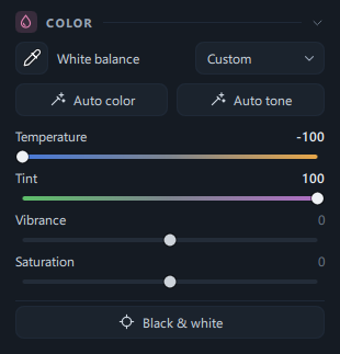
| COLOR — White balance · Auto color · Auto tone · Temperature · Tint · Vibrance · Saturation · Black & white | Slider table A, steps 1 · 2 · 5 |
| COLOR MIXER — Hue · Saturation · Luminance of eight colors | Slider table B, step 3 |
| COLOR GRADING — Tinting the shadows, midtones and highlights | Slider table C, step 6 |
| COLOR TARGETS — Adjusting just one color picked from the photo | Slider table D, step 4 |
| LOOK (LUT) — Applying a color mood from a .cube file | Slider table E, step 7 |
When to use it
- When a photo taken under lamps in the evening leans orange overall, so even white walls look yellowish — Eyedropper, Auto color
- When faces and white clothes look bluish in a photo taken in the shade or on a cloudy day — Temperature
- When colors look flat and you want them a little brighter, or they're too strong and you want them calmer — Vibrance, Saturation
- When you want to change just one color, such as making only the sky bluer or the leaves less yellow — Color Mixer
- When you want to keep the color of just a red coat and turn everything else black and white — Color Targets + Others' saturation
- When you're making a black-and-white photo and want to adjust skin lighter and sky darker separately — Black & white + B&W mix
- When you want a cinematic look, such as teal shadows and orange highlights — Color Grading
- When you want to apply a .cube look file you have to a photo — Look (LUT)
Where to find it
On the Edit tab, scroll down the right panel. After the EFFECTS panel, you'll find five color panels in this order.
| Panel | When first opened | What it covers |
|---|---|---|
| COLOR | Expanded | White balance (eyedropper · As shot) · Auto color · Auto tone · Temperature · Tint · Vibrance · Saturation · Black & white |
| COLOR MIXER | Expanded | Hue · Saturation · Luminance of Red · Orange · Yellow · Green · Aqua · Blue · Purple · Magenta, Targeted adjustment |
| COLOR GRADING | Collapsed | Hue and intensity of the shadows · midtones · highlights, Balance · Blending |
| COLOR TARGETS | Expanded | Adjusting only colors picked from the photo (up to 4), Others' saturation |
| LOOK (LUT) | Collapsed | Importing · choosing · strength of .cube files |
- Click a panel's title row to collapse or expand it. COLOR GRADING and LOOK (LUT) start out collapsed, so click their titles once to expand them.
- To change color in only part of the photo, use the Temperature · Tint · Vibrance · Saturation sliders each mask has on the Masks tab → Masks.
- While you hover over a preset on the Presets tab to preview it, these panels are dimmed and locked. You can use them again once the preview ends.
Sliders and buttons
Common actions — double-clicking a slider to return it to the default, clicking the number field to type a value, and dragging a slider's name left and right to adjust it — are explained in Editor overview. This section covers only what's specific to the color panels.
A. Color panel
| Name | Range | Default | What it does |
|---|---|---|---|
| Eyedropper (leftmost button on the white balance row) | Click | Off | Click it, then click once on a spot in the photo that should be gray or white, and Temperature and Tint are adjusted so that spot becomes neutral. When it succeeds, the eyedropper turns off automatically. |
| White balance | As shot · Custom | As shot | Choosing As shot returns Temperature and Tint to 0 (as captured). If Temperature or Tint isn't 0, it automatically shows Custom. |
| Auto color | Click | — | Estimates the color of the light when the photo was taken and adjusts only Temperature and Tint. Brightness isn't touched. |
| Auto tone | Click | — | Does the same thing as the Auto button at the top of the editor. Adjusts exposure, contrast, highlights/shadows, whites/blacks, vibrance and saturation to suit the photo. Temperature is left as is. For details, see Editor overview. |
| Temperature | −100–100 | 0 | The − side makes the photo cooler (blue); the + side makes it warmer (yellow, orange). The slider track is also colored from blue to yellow. |
| Tint | −100–100 | 0 | Shifts toward green on the − side and toward purple (magenta) on the + side. Use it to remove the green cast from fluorescent lighting. |
| Vibrance | −100–100 | 0 | Makes colors stronger (+) or paler (−). It changes pale colors more and already strong colors less, so colors don't get overdone. |
| Saturation | −100–100 | 0 | Makes all colors stronger (+) or paler (−) by the same proportion. At −100, all color is removed. |
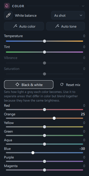
| Black & white | On · Off | Off | Turns the photo black and white. When on, the Vibrance · Saturation sliders and the COLOR MIXER · COLOR TARGETS panels are locked, and eight B&W mix sliders appear below instead. |
| Reset mix | Click | — | Shown only when Black & white is on. Returns all eight B&W mix sliders to 0. |
| B&W mix: Red · Orange · Yellow · Green · Aqua · Blue · Purple · Magenta | −100–100 | 0 | Turns areas that were originally that color into a lighter gray (+) or a darker gray (−). Use it to separate areas that differ in color but blend together in black and white because they have the same brightness (for example, red bricks and green grass). Raising a color doesn't blow it out to white. |
B. Color Mixer panel
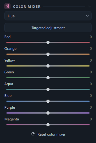
| Name | Range | Default | What it does |
|---|---|---|---|
| Drop-down list | Hue · Saturation · Luminance | Hue | Chooses what the eight sliders below change. The three sets of values are saved separately, so you can switch back and forth and use them together. |
| Targeted adjustment | Click | Off | Click it, then drag up or down over the color you want to change in the photo, and the sliders for that color move together (dragging up is +, dragging down is −). The change is applied when you release the mouse button, and you can drag several times while it's on. While it's on, the button text changes to Stop targeted adjustment · Esc. |
| Red · Orange · Yellow · Green · Aqua · Blue · Purple · Magenta | −100–100 | 0 | Hue: turns that color toward its neighbor on the color wheel (+ toward the next color in the order Red → Orange → Yellow …, − toward the previous one; about 30° at the extreme). Saturation: makes only that color stronger or paler. Luminance: makes only that color lighter or darker. |
| Reset color mixer | Click | — | Returns all three — Hue, Saturation and Luminance — to 0. |
C. Color Grading panel
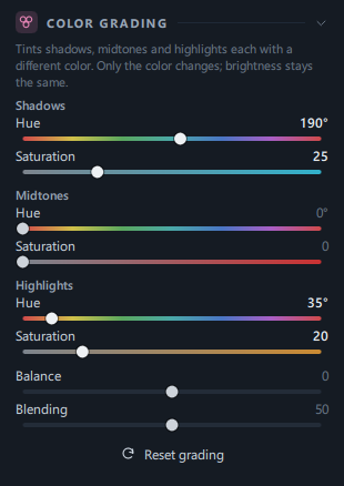
The description at the top of the panel: "Tints shadows, midtones and highlights each with a different color. Only the color changes; brightness stays the same."
| Name | Range | Default | What it does |
|---|---|---|---|
| Shadows · Hue | 0°–360° | 0° | The color to add to the dark areas. The slider is rainbow-colored, so the color you see at the slider's current position is the color that's added (0° red · 60° yellow · 120° green · 180° teal · 240° blue · 300° purple). |
| Shadows · Saturation | 0–100 | 0 | Sets how strongly that color is added. The hue shows up as you raise the saturation — raise the saturation a little first. The slider track is colored from gray to the selected color. |
| Midtones · Hue / Saturation | 0°–360° / 0–100 | 0° / 0 | The color and saturation to add to the mid-brightness areas. |
| Highlights · Hue / Saturation | 0°–360° / 0–100 | 0° / 0 | The color and saturation to add to the bright areas. |
| Balance | −100–100 | 0 | Moves the boundaries between the three ranges. On the + side, the highlight color spreads into darker areas; on the − side, the shadow color spreads into brighter areas. |
| Blending | 0–100 | 50 | Sets how much the three ranges overlap and blend smoothly. Lower values separate the colors of each range clearly; higher values mix them together. |
| Reset grading | Click | — | Returns all grading values to their starting state. |
D. Color Targets panel
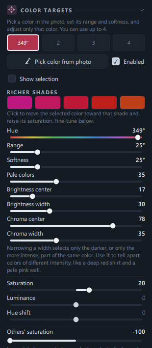
The description at the top of the panel: "Pick a color in the photo, set its range and softness, and adjust only that color. You can use up to 4."
| Name | Range | Default | What it does |
|---|---|---|---|
| Slots 1 · 2 · 3 · 4 | Selection | 1 | Chooses the target you're working on now. The selected slot gets a thicker border. Unused slots show their number; slots that are on are filled with the color picked from the photo and show that color's angle (for example, 12°). |
| Pick color from photo | Click | — | Click it, then click once on the photo to read the color around that spot into the selected slot and turn it on automatically. Range, softness, brightness and chroma are also set to match the spot you clicked. While it's waiting, Click on photo · Esc is shown; while it's reading, Reading… is shown. |
| Enabled | On · Off | Off (on once you pick a color) | Turns the selected slot's adjustment on and off. When off, the sliders below are dimmed. |
| Show selection | On · Off | Off | Shows where the selected color is picked up with yellow hatching on the photo. It appears only in the preview, never in exported files. It's hidden briefly while you drag a slider. |
| RICHER SHADES | 5 color swatches | — | Swatches that show the selected color and its neighbors in richer shades. Clicking one moves the selected color toward that shade and raises its saturation (Hue shift and a Saturation of 45 are applied). Then fine-tune with the sliders below. |
| Hue | 0°–360° | The picked color | The center of the color to pick up. The slider is rainbow-colored. |
| Range | 0°–120° | Set when you pick (25°–70°) | Sets how many degrees on each side of the center color are picked up fully. |
| Softness | 0°–120° | Set when you pick | The width over which the effect fades out beyond the range. The wider it is, the softer the transition. |
| Pale colors | 0–100 | Set when you pick (35 or more) | Sets whether pale colors close to gray are included too. Raise it to pick up pale colors such as a hazy sky or a faded roof; lower it to pick up only distinct colors. |
| Brightness center | 0–100 | The brightness of the clicked spot | Sets which brightness of the color to pick up. |
| Brightness width | 0–100 | Set when you pick | At 100, all brightness levels are picked up; lower it to pick up only those near Brightness center. Use it when you want only the darker part of the same color. |
| Chroma center | 0–100 | The chroma of the clicked spot | Sets how intense a color to pick up. |
| Chroma width | 0–100 | Set when you pick | Lower it to pick up only colors near Chroma center. Use it to tell apart things that have the same hue but different intensity, like a deep red shirt and a pale pink wall. |
| Saturation | −100–100 | 0 | Makes only the picked color stronger or paler. |
| Luminance | −100–100 | 0 | Makes only the picked color lighter or darker. |
| Hue shift | −100–100 | 0 | Turns the picked color around the color wheel (about 30° at the extreme). For example, you can move sky blue toward a deeper blue (cobalt). |
| Others' saturation | −100–100 | 0 | The saturation of colors not picked up by any slot. Lowering it below zero keeps only the selected colors and drains the rest; at −100, the rest turns gray. |
| Reset color targets | Click | — | Returns all four slots and Others' saturation to their starting state. |
E. Look (LUT) panel
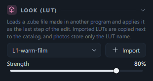
The description at the top of the panel: "Loads a .cube file made in another program and applies it as the last step of the edit. Imported LUTs are copied next to the catalog, and photos store only the LUT name."
| Name | Range | Default | What it does |
|---|---|---|---|
| LUT list | None · names of imported LUTs | None | Chooses the look to apply to this photo. With None, no look is used. |
| Import | Click | — | Choose a .cube file to add it to the list and apply it to the current photo right away. The file name becomes the name shown in the list. |
| Strength | 0–100% | 100% | Sets how strongly the look is applied. You can adjust it once you choose a LUT. |
Step by step
1. Fix an orange-tinted indoor photo — Eyedropper
- Open the Color panel on the Edit tab
On the Edit tab, scroll to the COLOR panel. The eyedropper-shaped button at the left of the top row is the white balance eyedropper.
- Click the eyedropper button
The button changes to its pressed state, and "Click a gray or neutral area in the photo." appears in the panel. Over the photo, the mouse pointer changes to an eyedropper.
- Click once on a spot that should be white or gray
Choose something that really has no color, such as a white wall, a white shirt, gray clothing or paper. Avoid blown-out white areas and pitch-black areas.
- Check the result
After a moment, Temperature and Tint change and White balance switches to Custom. The status bar at the bottom shows "White balance applied. Undo to revert.", and the eyedropper turns off automatically.
- If you don't like it, click a different spot
Click the eyedropper again and click another neutral area. To go back to the previous state, press Ctrl+Z.
- Keep some of the mood (optional)
If you want to keep the warm feel of an evening indoors, move Temperature back toward + a little.
To stop while the eyedropper is on, press Esc or click the eyedropper button once more.
2. Adjust in one click — Auto color
- Click Auto color
After a moment, Temperature and Tint change. Brightness sliders such as Exposure and Contrast stay as they are.
- Check the message in the status bar
Depending on the result, one of these three appears.
- "Auto color applied. Undo to revert." — It found areas that look neutral in the photo and adjusted to them.
- "No clear neutral found; estimated from the overall average. …" — The photo has almost no gray or white, like a sunset or a single-colored background. Check the result with your own eyes.
- "Auto color applied, but the adjustment range kept it from becoming fully neutral." — The color cast was so strong that the sliders reached their limit. You can correct the remaining cast further with the COLOR MIXER or the Tone Curve.
- To go back to the start
Choose As shot in the white balance list or press Ctrl+Z.
To adjust brightness as well, click Auto tone (or Auto at the top) next. The two buttons adjust different values, so you can click either one first.
3. Make only the sky bluer — Color Mixer
- Switch the drop-down list in the COLOR MIXER panel to Saturation.
- Raise the Blue slider toward +
The blue of the sky becomes stronger. If the sky is closer to teal, raise Aqua a little too.
- Switch to Luminance and lower Blue toward −
The sky gets deeper and the clouds stand out.
- If you're not sure which slider to use, use Targeted adjustment
Click the button, then hold down the mouse button over the sky in the photo and drag up, and the sliders for the sky go up together. The change is applied when you release the mouse button. Dragging down lowers them. The value that changes is the one currently selected in the drop-down list (Hue, Saturation or Luminance).
- Finish adjusting
Click the Stop targeted adjustment · Esc button or press Esc.
4. Keep color only on a red coat — Color Targets
- Make sure slot 1 is selected
Slot 1 is selected at first.
- Click Pick color from photo and click the coat once
Slot 1 is filled with the coat color, its angle is shown, and Enabled turns on. If you click an area with almost no color, the status bar shows "Pick an area that has color."
- Turn on Show selection to check what's picked up
The picked-up areas are shown with yellow hatching.
- Refine the picked-up area
- If not enough of the coat is picked up, widen Range · Softness.
- If similar colors such as lips or cheeks are picked up too, narrow Chroma width or Brightness width to keep just the coat.
- Lower Others' saturation to −100
Only the coat keeps its color, and the rest looks black and white. Around −40, the other colors remain subtly.
- To make the coat color stand out more
Raise Saturation toward +, or click one of the RICHER SHADES swatches.
Turn off Show selection and check the result. To add a second color, select slot 2 and repeat from step 2.
5. Make a black-and-white photo — Black & white + B&W mix
- Click Black & white at the bottom of the COLOR panel
The photo turns black and white, and a description and eight B&W mix sliders appear below.
- Lighten the skin
Raising Orange (skin, wood tones) toward + brightens the face.
- Darken the sky
Lowering Blue toward − darkens the sky and makes the clouds stand out.
- Finish the contrast
Add punch to the black-and-white photo with Contrast in Light and Black depth in Deep Blacks.
- (Optional) Make a warm black and white
Set the hue of Shadows in COLOR GRADING to around 30° and add a little saturation for a sepia-like tone. Grading still works after Black & white is turned on.
Turning Black & white off brings back the original colors; the B&W mix values stay saved and are used again when you turn it back on.
6. A cinematic look — Color Grading
- Click the COLOR GRADING panel title to expand it.
- Add teal to the shadows
First raise Saturation for Shadows to 20–30, then move Hue to around 180°–200°.
- Add orange to the highlights
Set Saturation for Highlights to 15–25 and Hue to around 30°–40°.
- Refine the boundary and blending
If the teal spreads too far, move Balance toward +; if the two colors look sharply divided, raise Blending.
To start over, click Reset grading.
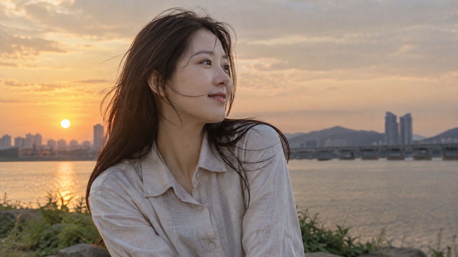
7. Apply a look you have — Look (LUT)
 BeforeAfter
The people in the sample photos were generated by AI.
- Click the LOOK (LUT) panel title to expand it.
- Click Import and choose a .cube file
The file name is added to the list and applied to the current photo right away.
- Adjust how much is applied with Strength
If 100% is too strong, lower it to about 50–70%.
- For other photos, just choose the name from the list
Once a look is imported, it stays in the list.
To remove the look, choose None in the list.
Result
 BeforeAfter
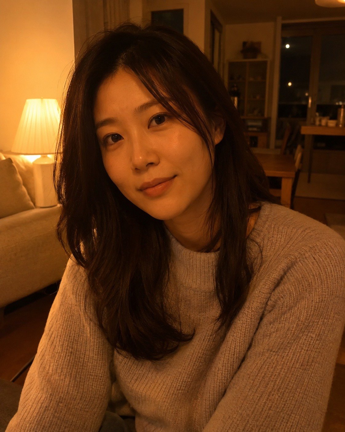
The orange cast that covered the whole photo disappears: the white wall turns white again and the skin returns to a natural peach tone.
The people in the sample photos were generated by AI.
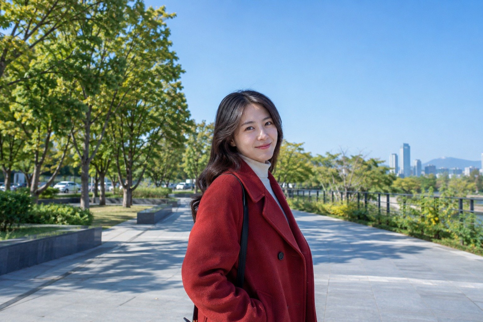
 BeforeAfter
Only the sky becomes deeper and bluer, while the red coat and the green trees keep their colors.
The people in the sample photos were generated by AI.
 BeforeAfter
Only the red coat keeps its color, while the sky, trees and street are drained of color as if in black and white.
The people in the sample photos were generated by AI.
 BeforeAfter
The skin comes alive as a light gray that stands apart from the background, and the dark areas take on a slight warm brown in the black-and-white photo.
The people in the sample photos were generated by AI.
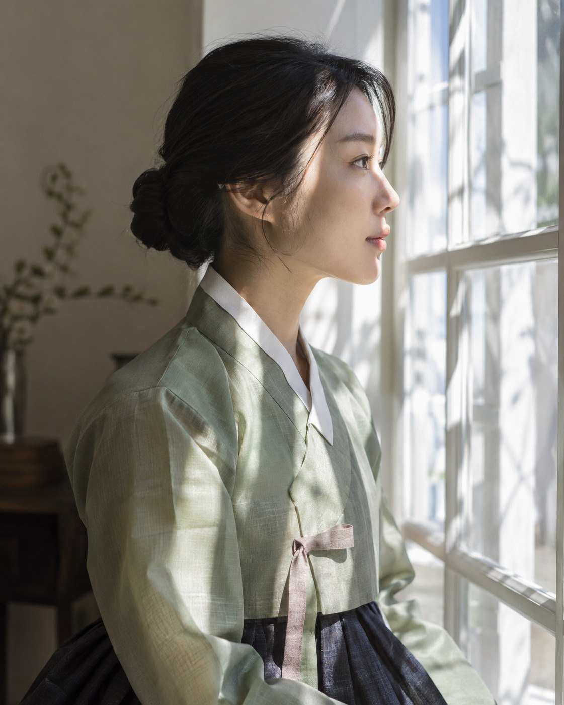
 BeforeAfter
With brightness unchanged, the shadows take on a teal tint and the areas lit by the window light turn orange, giving the photo the look of a movie scene.
The people in the sample photos were generated by AI.
Good to know
- Temperature numbers are relative to the captured color. 0 means "as captured", and the number shows how far the color has been moved from there. So the same number gives a different resulting color in each photo.
- The eyedropper averages a small area around the spot you click. Clicking an even surface (a wall, paper, clothing) is more accurate than clicking a patterned area.
- Auto color can remove the mood too. In photos where the warm light itself is the mood, such as sunsets, candlelight or incandescent bulbs, check the result and move Temperature back toward + a little.
- Auto tone = Auto at the top. Neither touches Temperature. Adjust color separately with Auto color.
- Vibrance vs. Saturation — Vibrance raises pale colors more and already strong colors less. Saturation raises all colors by the same proportion. For photos where skin easily turns red, such as portraits, try Vibrance first.
- What's locked when Black & white is on — The Vibrance · Saturation sliders and the COLOR MIXER · COLOR TARGETS panels. Their values aren't erased and apply again when you turn Black & white off. COLOR GRADING and LOOK (LUT) still work in black and white.
- Color Mixer vs. Color Targets — The Color Mixer adjusts eight fixed colors (Red to Magenta). Neighboring colors blend smoothly into each other, so moving Orange also moves the edges toward red and yellow a little. Color Targets pick up one color from the photo with the width you want, even distinguishing brightness and chroma. The Color Mixer is handy for changing a family of colors broadly; Color Targets are handy for changing the color of a single object.
- Only areas with color change. The Color Mixer and Color Targets leave areas with almost no color (white walls, gray skies) as they are, so no blotches appear. To pick up a pale sky too, raise Pale colors in Color Targets.
- Double-clicking a Color Targets slider sends it to 0 (the far left). When Range · Softness · Brightness width · Chroma width are at 0, almost nothing is picked up. To return to the values from your first pick, pick the color again with Pick color from photo.
- Sliders you adjust by dragging — You adjust the B&W mix, Color Grading and Color Targets sliders by dragging the slider itself.
- Use Others' saturation after turning on at least one Color Targets slot. "The others" are defined by the colors picked up in the slots that are on.
- The selection overlay (yellow hatching) is visible only on the Edit tab and isn't included in exported files.
- Color Grading changes only color. Brightness stays the same, so adding color to the shadows doesn't lift them.
- The look is applied at the very end of the edit. The look is applied on top of the image after all other color edits are done, and only the Deep Blacks panel is applied after it. If the blacks look washed out because of a look, try clicking Auto in Deep Blacks.
- Imported .cube files are copied to the photoKam data folder, and photos remember only the name. So it's fine to move or delete the original file. LUTs are identified by name, so rename the file before importing a different LUT (with the same name, "A LUT with the same name already exists" appears).
- Which .cube files you can import — 3D LUTs of size 2–64 are supported, and 1D LUTs can be read too. The file must be 64 MB or smaller. If a file can't be read, the reason is shown in the panel (for example, "There's no LUT size information.").
- The Color item in Copy edits and your own presets includes Temperature, Tint, Vibrance, Saturation, Color Mixer and Color Targets, plus Black & white, B&W mix and Color Grading. Choose Look (LUT) for each photo in the Look panel. → Presets · Editor overview
Frequently asked questions
When I click with the eyedropper, I get "That area is too dark or too bright. Click a gray or white area that still has detail."
The spot you clicked is pitch black or blown out to white. Click a gray or white area that's a little brighter (or a little less white). The eyedropper stays on, so you can click again right away.
After I clicked Auto color, the red glow of my sunset photo disappeared.
Auto color neutralizes the color of the light, so it treats sunset light as a "cast" too. Undo with Ctrl+Z, or raise Temperature toward + to bring the mood back.
COLOR MIXER and COLOR TARGETS are grayed out and locked.
Either Black & white is on, or a preset is being previewed. Turn Black & white off or end the preview.
No matter how much I turn the hue in COLOR GRADING, nothing changes.
The Saturation of that range is 0. Raise the saturation to around 20 first.
I clicked with Pick color from photo and got "Pick an area that has color."
The spot you clicked is nearly gray. Click an area with distinct color. If you want to pick up a pale color, pick the most intense part of it and then raise Pale colors.
I picked the sky with Color Targets, but blue clothing changes too.
That's because they're the same color. Narrow Brightness width · Chroma width to keep just the sky, or, to apply it only to the sky, select the sky in Masks and change its color there.
The Look panel says "The LUT file assigned to this photo (‘…’) can't be found. Showing it without the LUT."
The look file you applied to this photo is gone from the photoKam data folder. The photo remembers only the LUT's name, so importing a .cube file with the same name again with Import applies it as before.
Does changing the white balance change my original photo?
No. All edits are saved separately, and the original file stays as it is. Result files are created only through Export.